Wayfinding Signage Tips to Enhance the User Experience
Not many experiences can beat the frustration and helplessness of being lost. Being in an unfamiliar place, not knowing the streets or even which direction you're headed in is enough to put most people in a panic. Smart phones and GPS apps have made a huge difference, of course, but they're not perfect. They work great for highways and getting you to a general destination. But, it can be a little more tricky with the inner workings of a campus or business development. Nothing quite beats having well-placed and visible directional signage. Navigating is so much less stressful seeing your destination and an arrow pointing you in the right direction.
6 Guidelines to Ensure a Successful Wayfinding Campaign
Number of Destinations
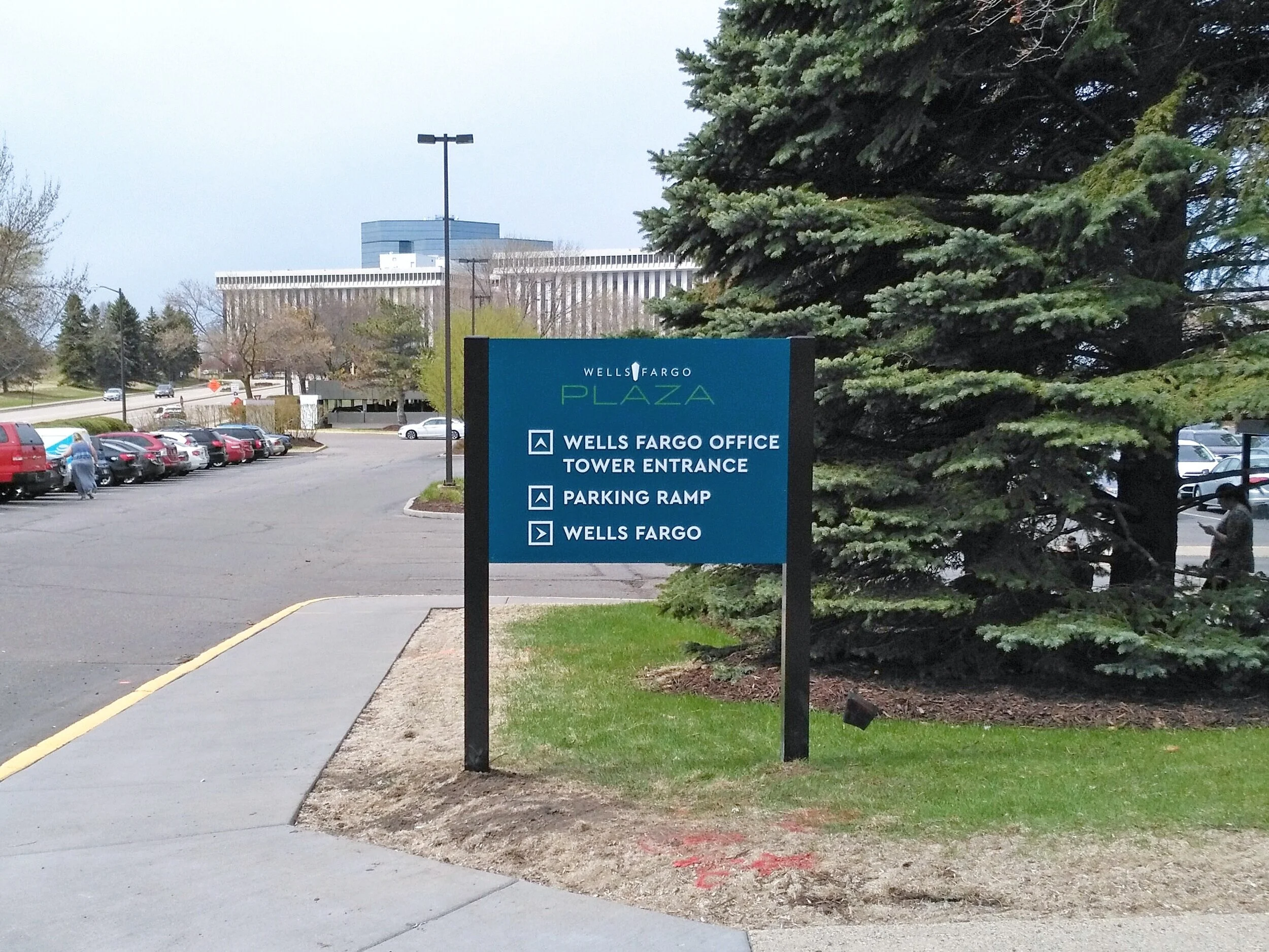
When creating custom exterior wayfinding systems, we've found it's important to limit them to 3-4 destinations per sign. Any more than that is too cluttered and takes too long to read. We want people to identify a direction and be able to make a decision without taking their eyes off the road for an unnecessary amount of time.
There's more flexibility for interior directional signs when it comes to number of destinations. People aren't driving and have more time to absorb the information and make a decision. You can also be more specific with the entities that are listed on the sign, such as listing suite numbers or tenant names.
Only List Priority Destinations
Since we're trying to limit the number of destinations on the sign, it's a good idea to make those the most important locations. Using a building name versus showing all the tenants occupying the building is an easy way to limit the number of destinations per sign. If that's the case, it's also important that your visitors and customers know what they're looking for—your employees and website should note the building you're located in, so that visitors are looking for a building name and not your business.
Location of Signs
Place signs at important decision making points. Intersections, driveways, or parking ramp entrances are perfect spots for directional signage. Keeping landscaping or trees controlled around the signage is also important to keep signs readable. You don't want to go through the trouble of creating a wayfinding plan and then let trees or shrubs take over and block the signage.
Include Symbols
Using symbols alongside wayfinding text can be a tool used to help make quick decisions. For example, your audience may not be fluent in English, so having international symbols for parking, hospital, or hotel can make a difference. They also stand out from the rest of the directional copy making it easy to identify.
Let Them Know They've Arrived
You can direct your customers and visitors all you want, but they need to know when they've arrived. Especially at campuses with any number of buildings or buildings with multiple entrances. Having supporting signage that labels a building or a specific entrance gives the assurance that they've arrived.
Make Sure Maps Match Signage
Most campuses with multiple buildings spread over a large area will have maps on their website. If a building on the map has a name or a label, it should be consistent on the signage. If there is more than one parking lot or ramp, that should also be listed. One thing to make sure of, is to update both maps and signage when changes such as construction or building additions occur.
Really, just remember to keep it simple! You don't want to overwhelm people with too much information. Wayfinding signage should be clean, easy to read and consistent across the board. If you're having difficulty creating a wayfinding plan or not really sure where to start, give Tennessee Sign Company a call today!


